Start with applications
List priority formats and reading conditions. A symbol that works on a poster may become unreadable in a small button. Test small sizes, monochrome and contrasting backgrounds before choosing solely from a spectacular presentation.
Build a restrained system
Define colours, typography, spacing, image styles and logo variants. Explain mandatory rules and permitted variation. Contradictory rules invite improvisation; too few rules leave every format telling a different brand story. Give each decision an example.
Preserve comprehension
Colour should not be the only way to communicate an error or action. Check contrast, readability and consistent interaction states. Accessibility involves more than choosing a palette: test actual journeys with the components people will use.
Prepare the handover
Supply sources, exports, usage rights and correct and incorrect examples. Name a version owner. A practical guide explains how to apply the system instead of ending with a sheet of logos.
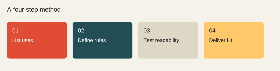
- List uses
- Define rules
- Test readability
- Deliver kit
Worked example
Minimum kit: vector logo, approved variants, role-based palette, text styles, action components and document examples. Handover test: a non-designer should be able to build a consistent page from the kit.
Check before moving on
These checkboxes are not saved.
Sources & method
Sources reviewed on 1 October 2026. Worked calculations use explicitly hypothetical inputs.
Topic provenance: Comment construire une identité visuelle forte ? (consulted capture: 2023-11-30). Search Engine Feng Shui. This record does not confirm an individual byline.
This guide is newly written in 2026. It does not reproduce the earlier text and is not attributed to its historical author.