Identify the relationship
A timeline shows order, a diagram shows a process and a table compares criteria. Do not choose a chart solely to decorate a page. If values are not comparable, explain their differences instead of drawing an unjustified common scale.
Make sources readable
State units, period and origin of numbers. Distinguish observations from teaching examples. Percentages need understandable denominators; an isolated figure in a large circle is not evidence. Keep labels close to the values they describe.
Provide a text equivalent
Add suitable alt text, a caption and an explanation. Important relationships should not depend entirely on colour. Check narrow-screen readability and avoid tiny lettering in an image that people cannot meaningfully inspect or enlarge.
Verify interpretation
Ask someone outside the project to explain what they understand. If they infer a conclusion contradicted by the data, revise titles, scales or labels. Keep the source file so the representation can be corrected as information changes.
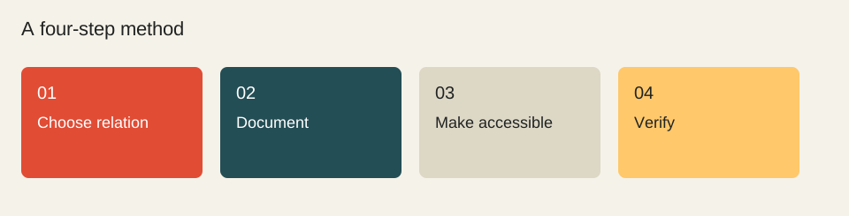
- Choose relation
- Document
- Make accessible
- Verify
Worked example
Infographic sheet: question / relationship / source / unit / period / text equivalent / mobile check. For a procedure, four explained steps are more useful than an unordered diagram without context.
Check before moving on
These checkboxes are not saved.
Sources & method
Sources reviewed on 1 October 2026. Worked calculations use explicitly hypothetical inputs.
Topic provenance: La communication visuelle : de quoi s’agit-il ? (consulted capture: 2023-03-20). Search Engine Feng Shui. This record does not confirm an individual byline.
This guide is newly written in 2026. It does not reproduce the earlier text and is not attributed to its historical author.